What’s the best way to add a subtle box shadow for depth without affecting performance?
What’s the Best Way to Add a Subtle Box Shadow for Depth Without Affecting Performance?
Adding subtle depth to UI elements using shadows is one of the most effective ways to improve visual hierarchy, usability, and aesthetics. Buttons feel clickable, cards feel layered, and modals feel elevated. However, poorly implemented shadows — especially large blurred ones on many elements — can hurt rendering performance, particularly on low-end devices or during animations and scrolling.
In this guide, we’ll explore:
✅ How box shadows affect browser performance
✅ The best-practice shadow patterns used in modern UI systems
✅ How to create subtle, beautiful shadows that are cheap to render
✅ Multiple code examples (CSS + real-world layouts)
✅ Advanced tips for hover states, animations, and dark mode
By the end, you’ll know exactly how to add depth without sacrificing speed or smoothness.
🔍 Why Shadows Can Affect Performance
Before choosing the best approach, it helps to understand what the browser does when rendering a shadow.
When you write:
box-shadow: 0 10px 40px rgba(0, 0, 0, 0.3);
The browser must:
- Blur the shadow
- Rasterize it
- Composite it with surrounding layers
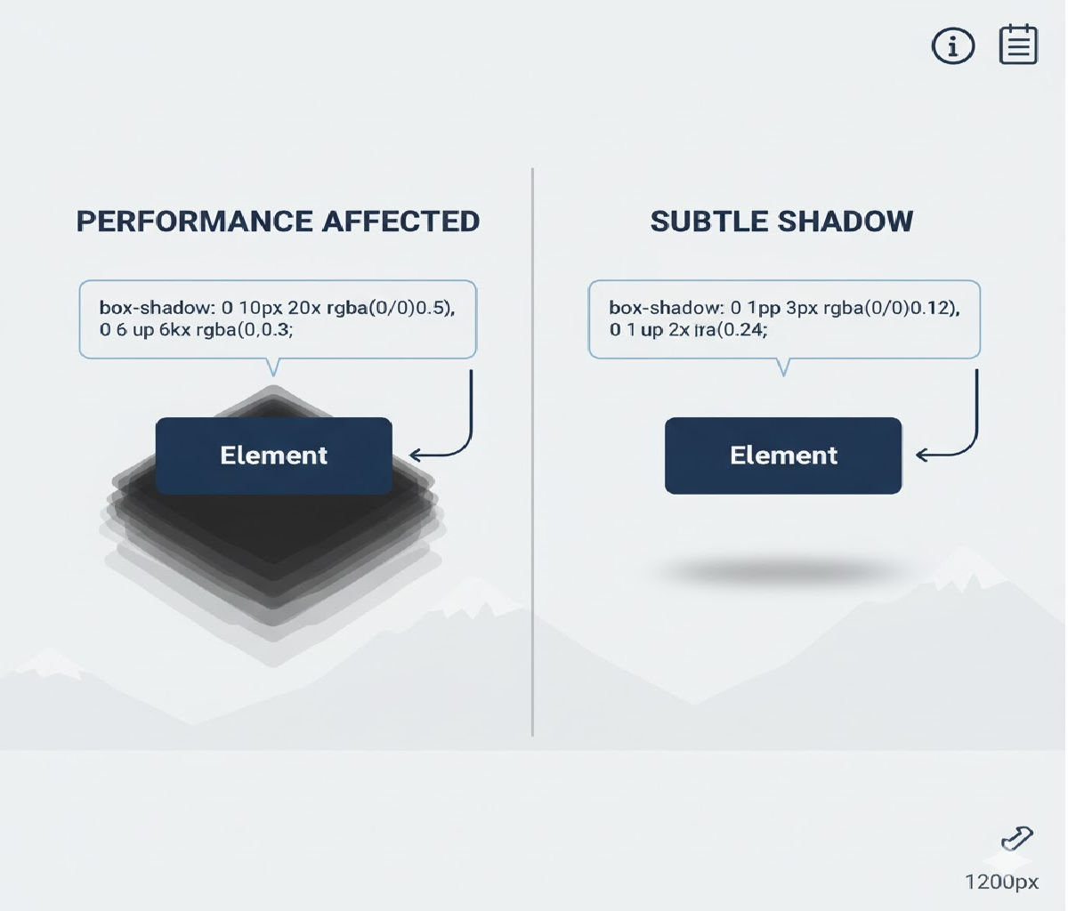
Large blur radii, big spreads, multiple layered shadows, or animating shadow values force expensive repaints and can cause frame drops, especially in scrolling lists or animated UI components.
So performance-friendly shadows should be:
✔ Small blur radius
✔ Low opacity
✔ Rarely animated
✔ Applied to fewer elements
✔ Cached by the compositor when possible
🏆 Best Overall Practice (Industry Standard)
Use a single, low-blur
box-shadowwith small offsets and low opacity. Avoid animating shadow blur or spread.
This pattern is used in Material Design, Apple Human Interface Guidelines, and modern design systems like Tailwind, Chakra, and Fluent UI.
Example
.card {
  box-shadow: 0 1px 3px rgba(0, 0, 0, 0.12),
              0 1px 2px rgba(0, 0, 0, 0.08);
}
This creates soft depth with almost no performance cost.
✅ Method 1: Use a Single Low-Blur Shadow (Fastest & Most Reliable)
Concept
Use small offsets and blur radii, keeping opacity under ~15%. This gives depth without drawing attention — and it’s cheap for the browser to render.
Example
HTML
<div class="panel">Subtle shadow panel</div>
CSS
.panel {
  padding: 20px;
  background: white;
  border-radius: 10px;
  box-shadow: 0 2px 6px rgba(0, 0, 0, 0.08);
}
Why It’s Fast
- Single shadow layer
- Small blur radius
- Low alpha channel
When to Use
✔ Cards
✔ Buttons
✔ Tooltips
✔ Modals
✔ Lists
This is the best general-purpose solution.
✅ Method 2: Use Two-Layer Shadows for Natural Depth (Still Very Fast)
Many design systems layer two very subtle shadows instead of one strong shadow to simulate natural light diffusion.
Example
.surface {
  box-shadow:
    0 1px 2px rgba(0, 0, 0, 0.06),
    0 4px 10px rgba(0, 0, 0, 0.04);
}
Why It Works
- First shadow adds crisp edge separation
- Second adds soft elevation
- Still low blur and opacity → high performance
When to Use
✔ Cards
✔ Navigation bars
✔ Floating panels
✔ Elevated sections
This is widely used in Material UI and iOS UI components.
✅ Method 3: Prefer Static Shadows + Animate Transform Instead
Problem
Animating box-shadow directly is expensive because it triggers repaints on every frame.
Solution
Use a static shadow, and animate transform: translateY() or scale() instead.
Example: Hover Lift Without Shadow Animation
HTML
<button class="lift-btn">Hover me</button>
CSS
.lift-btn {
  padding: 12px 20px;
  background: white;
  border-radius: 8px;
  border: none;
  box-shadow: 0 2px 6px rgba(0, 0, 0, 0.12);
  transition: transform 0.2s ease;
  cursor: pointer;
}

.lift-btn:hover {
  transform: translateY(-2px);
}
Why It’s Fast
transformis GPU-accelerated- No repaints, only compositing
- Shadow stays static → no expensive recalculation
Best Practice
Never animate blur radius, spread, or opacity of shadows unless necessary.
✅ Method 4: Use filter: drop-shadow() for Transparent or Irregular Shapes
If you’re applying shadows to SVGs or transparent images, box-shadow won’t work correctly because it shadows the bounding box instead of the visible shape. Use filter: drop-shadow() instead.
Example
.icon {
  filter: drop-shadow(0 2px 4px rgba(0, 0, 0, 0.2));
}
Performance Notes
- Slightly more expensive than box-shadow
- Fine for occasional use
- Avoid animating blur values
When to Use
✔ SVG icons
✔ PNG images with transparency
✔ Floating shapes
✅ Method 5: Use Pseudo-Elements for Ultra-Lightweight Shadows
For extremely performance-sensitive interfaces (dashboards, data grids, infinite lists), you can simulate shadows using pseudo-elements instead of blur effects.
Example
HTML
<div class="soft-card">Optimized card</div>
CSS
.soft-card {
  position: relative;
  padding: 20px;
  background: white;
  border-radius: 10px;
}

.soft-card::after {
  content: "";
  position: absolute;
  inset: auto 8px -8px 8px;
  height: 8px;
  background: rgba(0, 0, 0, 0.08);
  filter: blur(6px);
  border-radius: 50%;
  z-index: -1;
}
Why It’s Fast
- Shadow is pre-defined
- No dynamic blur computation per frame
- Paint cost is predictable
When to Use
✔ Large tables
✔ Scroll-heavy UIs
✔ Performance-critical dashboards
🔥 Best Practice Shadow Scale (Production-Ready)
Here’s a performance-friendly shadow scale you can safely use across an entire design system.
:root {
  --shadow-xs: 0 1px 2px rgba(0, 0, 0, 0.05);
  --shadow-sm: 0 1px 3px rgba(0, 0, 0, 0.08);
  --shadow-md: 0 4px 10px rgba(0, 0, 0, 0.10);
  --shadow-lg: 0 8px 20px rgba(0, 0, 0, 0.12);
}
Usage:
.card {
  box-shadow: var(--shadow-sm);
}

.modal {
  box-shadow: var(--shadow-lg);
}
This pattern is used by Tailwind CSS, Material UI, and Chakra UI — optimized for readability and performance.
⚡ Performance Comparison
| Technique | GPU Friendly | Layout Safe | Animation Friendly | Performance Cost |
|---|---|---|---|---|
| Single low-blur box-shadow | ✅ | ✅ | ⚠️ (don’t animate) | ⭐⭐⭐⭐⭐ |
| Two-layer subtle shadows | ✅ | ✅ | ⚠️ | ⭐⭐⭐⭐ |
| Static shadow + transform animation | ✅ | ✅ | ✅ | ⭐⭐⭐⭐⭐ |
filter: drop-shadow() | ⚠️ | ✅ | ⚠️ | ⭐⭐⭐ |
| Pseudo-element shadow | ✅ | ✅ | ✅ | ⭐⭐⭐⭐⭐ |
| Large blurred shadows | ❌ | ✅ | ❌ | ⭐ |
🎯 Real-World Example: Card Grid with Performance-Safe Depth
Let’s build a modern card layout that uses subtle shadows and GPU-friendly hover effects.
HTML
<div class="grid">
  <article class="card">Dashboard</article>
  <article class="card">Analytics</article>
  <article class="card">Reports</article>
</div>
CSS
.grid {
  display: grid;
  grid-template-columns: repeat(auto-fit, minmax(180px, 1fr));
  gap: 20px;
}

.card {
  padding: 24px;
  background: white;
  border-radius: 14px;
  box-shadow: 0 2px 6px rgba(0, 0, 0, 0.08);
  transition: transform 0.2s ease;
  will-change: transform;
}

.card:hover {
  transform: translateY(-3px);
}
Why This Is Fast
- Single small shadow
- Only
transformanimates - No shadow recalculation on hover
- GPU handles compositing
This pattern scales to thousands of elements without frame drops.
♿ Accessibility & Usability Considerations
- Avoid relying on shadow alone to indicate interactivity — combine with:
- Color change
- Cursor change
- Slight motion
- Ensure enough contrast between shadow and background.
- Respect reduced-motion preferences:
@media (prefers-reduced-motion: reduce) {
  .card {
    transition: none;
  }
}
⚠️ Common Mistakes That Hurt Performance
❌ Large blur radius
box-shadow: 0 20px 80px rgba(0, 0, 0, 0.3);
This is expensive to render and visually overpowering.
❌ Animating box-shadow directly
.card {
  transition: box-shadow 0.3s ease; /* ❌ expensive */
}
Triggers repaints every frame — avoid this.
❌ Applying shadows to thousands of scrolling items
Virtualize lists or use lightweight pseudo-element shadows instead.
❌ Using too many layered shadows
More than two layers rarely improve perception but always increase paint cost.
🧠 Advanced Technique: Shadow + Overlay Gradient for Ultra-Soft Depth
Instead of blur-heavy shadows, you can simulate depth using gradients.
Example
.soft-depth {
  position: relative;
  background: white;
  border-radius: 12px;
  padding: 20px;
  overflow: hidden;
}

.soft-depth::after {
  content: "";
  position: absolute;
  inset: auto 0 0 0;
  height: 20px;
  background: linear-gradient(to bottom, transparent, rgba(0, 0, 0, 0.05));
  pointer-events: none;
}
This creates a subtle bottom depth cue — zero blur cost.
🧪 Dark Mode Friendly Shadows
In dark mode, dark shadows become invisible. Instead, use light glows:
.dark-card {
  background: #1e1e1e;
  box-shadow: 0 2px 6px rgba(255, 255, 255, 0.08);
}
Or use layered surfaces:
.dark-card {
  background: #242424;
  border: 1px solid rgba(255, 255, 255, 0.06);
}
This approach is more readable and cheaper than blur-heavy effects.
🏆 Best Overall Recommendation
Use a single, subtle
box-shadowwith low blur and opacity, and animate onlytransform— never the shadow itself.
Gold Standard Pattern
.surface {
  background: white;
  border-radius: 10px;
  box-shadow: 0 2px 6px rgba(0, 0, 0, 0.08);
  transition: transform 0.2s ease;
}

.surface:hover {
  transform: translateY(-2px);
}
This delivers:
✔ Beautiful depth
✔ Zero layout shift
✔ GPU-accelerated animations
✔ Excellent performance
✔ Cross-browser reliability
📌 Final Summary
To add subtle box shadow for depth without affecting performance:
- Use small blur radii (2–10px) and low opacity (5–12%)
- Prefer single or two-layer shadows
- Avoid animating shadows — animate transform instead
- Use
filter: drop-shadow()only for transparent shapes - Use pseudo-element shadows for large-scale performance-critical layouts


