What happens if you use background-attachment: fixed on mobile devices?

What Happens If You Use background-attachment: fixed on Mobile Devices?
The CSS property background-attachment: fixed is commonly used to create parallax-like scrolling effects, where the background image stays fixed in place while the content scrolls over it. On desktop browsers, this effect works reliably and is widely supported. However, on mobile devices, the behavior is very different — and often confusing — for developers.
In many mobile browsers, background-attachment: fixed is:
- ❌ Ignored completely
- ❌ Treated as
scroll - ❌ Disabled for performance reasons
- ❌ Inconsistent across browsers and OS versions
This article provides a deep technical and practical explanation of what actually happens when you use background-attachment: fixed on mobile, why browsers behave this way, how different platforms handle it, and what alternatives you should use instead — with real code examples.
1. Understanding background-attachment
Before diving into mobile behavior, let’s clarify what background-attachment does.
Property Definition
background-attachment: scroll | fixed | local;
Values
| Value | Meaning |
|---|---|
scroll | Background scrolls with the element (default) |
fixed | Background stays fixed relative to the viewport |
local | Background scrolls with the element’s contents |
Typical Desktop Use
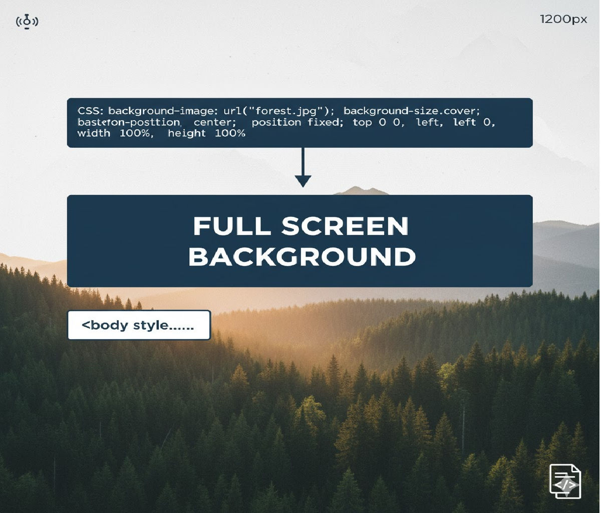
.hero {
  background-image: url("mountains.jpg");
  background-size: cover;
  background-position: center;
  background-attachment: fixed;
}
On desktop, this creates a parallax effect where the background remains stationary while the page scrolls.
2. What Actually Happens on Mobile Devices?
On most mobile browsers — especially iOS Safari and Chrome for Android — background-attachment: fixed does not behave as expected.
Instead:
- The browser ignores
fixedand treats it asscroll - The background moves with the content
- No parallax effect appears
- In some cases, rendering glitches occur
Example (That Works on Desktop but Not Mobile)
.section {
  min-height: 100vh;
  background-image: url("bg.jpg");
  background-size: cover;
  background-position: center;
  background-attachment: fixed;
}
Desktop:
✔ Background stays fixed
✔ Content scrolls over it
Mobile:
❌ Background scrolls normally
❌ No parallax effect
❌ Sometimes janky scrolling
3. Why Mobile Browsers Disable background-attachment: fixed
The main reasons are performance, memory usage, and rendering complexity.
A. Scrolling Performance
Mobile devices rely heavily on GPU acceleration and compositing layers. Fixed backgrounds require:
- Continuous repainting during scroll
- Large offscreen textures
- Complex compositing pipelines
This leads to:
❌ Frame drops
❌ Jank
❌ Increased battery drain
❌ Touch scrolling latency
To preserve smooth scrolling, mobile browsers often disable fixed backgrounds altogether.
B. Viewport Resizing and Dynamic Toolbars
Mobile viewports are not static:
- Address bars appear and disappear
- Virtual keyboards resize the viewport
- Orientation changes dynamically
A fixed background relative to the viewport becomes extremely difficult to manage consistently under these conditions.
C. Memory Constraints
Fixed background images often involve large textures (especially hero images). On mobile:
- GPU memory is limited
- Large fixed layers can crash tabs
- Browsers aggressively optimize memory use
Disabling fixed backgrounds avoids these risks.
4. Behavior by Platform and Browser
Let’s break down what happens on major mobile platforms.
iOS Safari (All Versions)
- ❌
background-attachment: fixedis ignored - Behaves exactly like
scroll - No workaround using pure CSS
- This is intentional and documented behavior
Example:
.hero {
  background-attachment: fixed; /* ignored on iOS */
}
Effect on iPhone/iPad Safari:
✔ Scrolls normally
❌ No fixed background
Chrome on Android
- Historically ignored
- Some versions briefly attempted partial support
- Modern versions mostly treat it as
scroll - Occasionally buggy or inconsistent
Samsung Internet Browser
- Similar to Chrome Android
- Mostly ignores
fixed - Some older versions show jittery results
Firefox for Android
- Historically ignored
- Now supports limited cases
- Still unreliable for production use
Mobile WebView (Android/iOS apps)
- Often behaves like Safari/Chrome mobile
fixedalmost always ignored
5. Example: Desktop vs Mobile Behavior
HTML
<section class="parallax">
  <h1>Parallax Section</h1>
</section>
CSS
.parallax {
  min-height: 100vh;
  background-image: url("mountains.jpg");
  background-size: cover;
  background-position: center;
  background-attachment: fixed;

  display: flex;
  align-items: center;
  justify-content: center;
  color: white;
  font-size: 3rem;
}
Result:
| Platform | Behavior |
|---|---|
| Desktop Chrome | Background fixed, parallax effect |
| Desktop Firefox | Background fixed |
| iOS Safari | Background scrolls |
| Chrome Android | Background scrolls |
6. Visual Consequences on Mobile
Because fixed is ignored:
- The illusion of depth disappears
- Backgrounds behave like normal images
- Layout may look flat
- Designers may assume something is broken
- Scroll-based designs lose impact
In some older mobile browsers:
- Flickering backgrounds
- White gaps during scroll
- Incorrect cropping
- Rubber-banding artifacts
7. Why Not Just Force It with CSS?
There is no reliable pure-CSS workaround that forces background-attachment: fixed on mobile browsers — especially iOS.
This is because:
✔ It’s blocked at the rendering engine level
✔ It’s not a bug — it’s an intentional design choice
✔ Browser vendors prioritize smooth scrolling over visual effects
8. Best Practice: Do Not Rely on background-attachment: fixed for Mobile
Because support is inconsistent and often disabled, production-ready websites should:
❌ Avoid relying on background-attachment: fixed
✔ Use progressive enhancement
✔ Provide mobile-friendly alternatives
9. Detecting Mobile and Disabling fixed
A common pattern is to disable fixed backgrounds on mobile using media queries or feature detection.
CSS Example
.section {
  background-image: url("bg.jpg");
  background-size: cover;
  background-position: center;
  background-attachment: fixed;
}

@media (max-width: 768px) {
  .section {
    background-attachment: scroll;
  }
}
This ensures:
- Desktop users get parallax
- Mobile users get smooth scrolling
10. Recommended Alternative: CSS Transform-Based Parallax
Instead of relying on background-attachment: fixed, modern designs use:
position: absoluteorfixedtransform: translateY()- IntersectionObserver or scroll events
These approaches work reliably on mobile.
11. Mobile-Friendly Parallax Using Pseudo-Elements
HTML
<section class="parallax-section">
  <h1>Mobile-Friendly Parallax</h1>
</section>
CSS
.parallax-section {
  position: relative;
  min-height: 100vh;
  overflow: hidden;
  display: flex;
  align-items: center;
  justify-content: center;
  color: white;
  font-size: 3rem;
}

.parallax-section::before {
  content: "";
  position: absolute;
  inset: 0;
  background-image: url("mountains.jpg");
  background-size: cover;
  background-position: center;
  transform: translateZ(0);
  will-change: transform;
  z-index: -1;
}
This alone doesn’t create parallax, but sets the stage for JS-based scroll animation.
12. JavaScript-Based Parallax (Mobile Safe)
HTML
<section class="parallax-js">
  <h1>JS Parallax</h1>
</section>
CSS
.parallax-js {
  position: relative;
  min-height: 100vh;
  overflow: hidden;
  display: flex;
  align-items: center;
  justify-content: center;
  color: white;
  font-size: 3rem;
}

.parallax-js::before {
  content: "";
  position: absolute;
  inset: 0;
  background-image: url("mountains.jpg");
  background-size: cover;
  background-position: center;
  transform: translateY(0);
  will-change: transform;
  z-index: -1;
}
JavaScript
<script>
  const section = document.querySelector(".parallax-js");

  window.addEventListener("scroll", () => {
    const rect = section.getBoundingClientRect();
    const offset = rect.top * 0.3;
    section.style.setProperty("--offset", `${offset}px`);
  });
</script>
Enhanced CSS
.parallax-js::before {
  transform: translateY(var(--offset));
}
This works smoothly across desktop and mobile without relying on background-attachment: fixed.
13. Another Alternative: Using <img> with position: fixed
HTML
<div class="fixed-wrapper">
  <img src="bg.jpg" alt="" class="fixed-bg">
  <div class="content">
    <h1>Fixed Background</h1>
    <p>This works on mobile.</p>
  </div>
</div>
CSS
.fixed-wrapper {
  position: relative;
  min-height: 200vh;
}

.fixed-bg {
  position: fixed;
  inset: 0;
  width: 100%;
  height: 100%;
  object-fit: cover;
  z-index: -1;
}

.content {
  position: relative;
  color: white;
  padding: 4rem;
}
This simulates a fixed background and works across platforms, including mobile — though it must be used carefully to avoid performance issues.
14. Accessibility Considerations
Parallax and fixed backgrounds can:
- Cause motion sickness
- Reduce readability
- Distract users with vestibular disorders
Always respect reduced-motion preferences:
@media (prefers-reduced-motion: reduce) {
  .parallax,
  .parallax-js::before {
    transform: none !important;
    background-attachment: scroll !important;
  }
}
15. Performance Considerations on Mobile
Even with alternatives:
✔ Avoid large images
✔ Use WebP/AVIF
✔ Compress aggressively
✔ Avoid scroll event spam
✔ Prefer requestAnimationFrame
✔ Use will-change: transform carefully
Bad example:
window.addEventListener("scroll", heavyFunction);
Good example:
let ticking = false;

window.addEventListener("scroll", () => {
  if (!ticking) {
    window.requestAnimationFrame(() => {
      updateParallax();
      ticking = false;
    });
    ticking = true;
  }
});
16. Progressive Enhancement Strategy
Best practice:
- Default to normal scrolling backgrounds
- Enhance on large screens only
.section {
  background-image: url("bg.jpg");
  background-size: cover;
  background-position: center;
  background-attachment: scroll;
}

@media (hover: hover) and (min-width: 1024px) {
  .section {
    background-attachment: fixed;
  }
}
This ensures:
✔ Desktop users get parallax
✔ Mobile users get smooth scrolling
✔ No broken layouts
17. Why Some Developers Think It Works on Mobile
Sometimes developers test on:
- Mobile Chrome in desktop emulation
- Small browser windows
- Tablets with desktop-class browsers
These environments may support fixed, but real mobile Safari and Chrome behave differently.
Always test on actual devices.
18. Summary of Mobile Behavior
When you use:
background-attachment: fixed;
On mobile devices:
- ❌ The property is usually ignored
- ❌ Treated as
scroll - ❌ No parallax effect
- ❌ Sometimes causes rendering glitches
- ✔ This is intentional for performance reasons
19. Best Practice Recommendation
Do not rely on background-attachment: fixed for production mobile designs.
Instead:
✔ Use CSS transform-based parallax
✔ Use positioned <img> elements
✔ Use IntersectionObserver
✔ Use media queries for progressive enhancement
20. Final Answer
On mobile devices, background-attachment: fixed is mostly ignored and behaves the same as background-attachment: scroll. This is because mobile browsers disable fixed backgrounds to preserve smooth scrolling, reduce memory usage, and avoid rendering glitches caused by dynamic viewports and limited GPU resources.
Safe Desktop + Mobile Pattern
.section {
  background-image: url("bg.jpg");
  background-size: cover;
  background-position: center;
  background-attachment: scroll;
}

@media (min-width: 1024px) {
  .section {
    background-attachment: fixed;
  }
}