What happens if you set flex: 1 on all child elements in a flex container?
What happens when you apply:
flex: 1;
to all child elements inside a flex container.
✅ What Happens If You Set flex: 1 on All Child Elements in a Flex Container?
📌 Short Answer
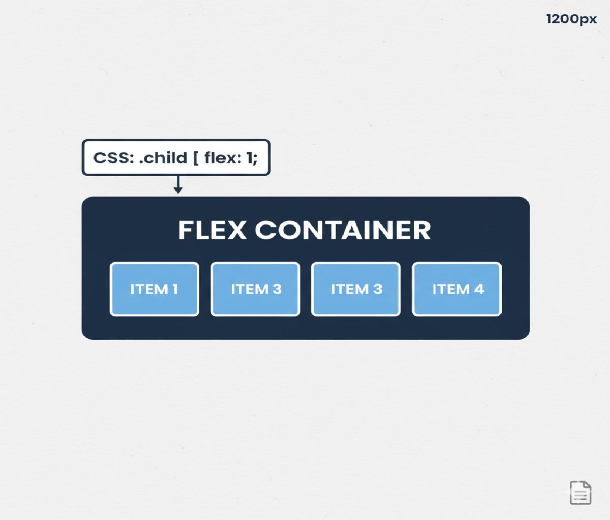
When you apply:
.child {
  flex: 1;
}
to every child element inside a flex container, all children:
✔ Take equal width (or height)
✔ Automatically stretch to fill available space
✔ Ignore their intrinsic size (unless constrained)
✔ Create a responsive, fluid layout
In other words, every child becomes a flexible column or row that shares space evenly.
🔍 Understanding flex: 1 in Detail
The flex property is shorthand for:
flex: <flex-grow> <flex-shrink> <flex-basis>;
So when you write:
flex: 1;
It expands to:
flex-grow: 1;
flex-shrink: 1;
flex-basis: 0%;
Let’s break that down:
| Property | Meaning |
|---|---|
flex-grow: 1 | The item can grow and share available space |
flex-shrink: 1 | The item can shrink when space is tight |
flex-basis: 0% | Start from zero size and distribute space equally |
This combination is what makes flex: 1 so powerful for layouts.
📦 Basic Example: Equal Width Columns
HTML
<div class="container">
  <div class="box">One</div>
  <div class="box">Two</div>
  <div class="box">Three</div>
</div>
CSS
.container {
  display: flex;
  border: 2px solid #333;
}

.box {
  flex: 1;
  padding: 20px;
  border: 1px solid #999;
  text-align: center;
}
✅ Result
All three boxes:
✔ Have exactly equal widths
✔ Fill the entire container
✔ Resize automatically when the screen changes
Even if the text lengths differ, each box occupies one-third of the container width.
🧠 Why Does flex: 1 Make Elements Equal Size?
Because of:
flex-basis: 0%;
This forces all items to start at zero width, and then they divide the available space equally using flex-grow: 1.
So if there are:
| Items | Space per Item |
|---|---|
| 2 | 50% each |
| 3 | 33.33% each |
| 4 | 25% each |
📏 Example With Unequal Content Lengths
HTML
<div class="container">
  <div class="box">Short</div>
  <div class="box">Much Longer Content Here</div>
  <div class="box">Mid</div>
</div>
CSS
.container {
  display: flex;
}

.box {
  flex: 1;
  padding: 16px;
  border: 1px solid black;
}
🔎 Output Behavior
Even though the second box contains much more text, all three boxes remain the same width.
This is different from:
flex: auto;
which allows content size to influence width.
🔄 What Happens on Small Screens?
Because flex-shrink: 1 is enabled by default in flex: 1, children:
✔ Shrink proportionally
✔ Avoid overflow when possible
✔ Remain equal-sized
Example:
.container {
  display: flex;
  width: 300px;
}
Even if three children exist, they compress equally to fit into the smaller space.
📐 Vertical Layout (Column Direction)
If you change the container direction:
.container {
  display: flex;
  flex-direction: column;
}
Then:
.child {
  flex: 1;
}
Each child takes equal height, filling the container vertically.
🧪 Example: Equal Height Panels
HTML
<div class="column-container">
  <div class="panel">Top</div>
  <div class="panel">Middle</div>
  <div class="panel">Bottom</div>
</div>
CSS
.column-container {
  display: flex;
  flex-direction: column;
  height: 300px;
  border: 2px solid #333;
}

.panel {
  flex: 1;
  border: 1px solid #999;
  display: flex;
  align-items: center;
  justify-content: center;
}
✅ Result
Each panel gets exactly 100px height, regardless of content.
📊 Comparison: flex: 1 vs Other Flex Values
| Value | Meaning |
|---|---|
flex: 1 | Equal space distribution |
flex: auto | Size based on content, then grow |
flex: none | No grow, no shrink |
flex: 2 | Grows twice as much as flex: 1 |
flex: 0 0 auto | Fixed width |
⚖ Example: Mixed Flex Values
.container {
  display: flex;
}

.box1 {
  flex: 1;
}

.box2 {
  flex: 2;
}

.box3 {
  flex: 1;
}
Result
Total grow = 1 + 2 + 1 = 4
So widths:
| Box | Width |
|---|---|
| box1 | 25% |
| box2 | 50% |
| box3 | 25% |
🚫 What Happens to Intrinsic Widths?
When using flex: 1, intrinsic widths like:
width: 200px;
Are overridden unless:
flex-basis: auto;
or:
flex: 1 1 auto;
Example:
.box {
  flex: 1;
  width: 300px;
}
The width is ignored because flex-basis: 0% takes priority.
📐 Example: Preserving Content Width Instead
If you want equal growth but respect base sizes:
.box {
  flex: 1 1 auto;
}
Now each box starts at its content width and then grows proportionally.
📱 Responsive Layout Example (Navbar)
HTML
<nav class="navbar">
  <a href="#">Home</a>
  <a href="#">About</a>
  <a href="#">Services</a>
  <a href="#">Contact</a>
</nav>
CSS
.navbar {
  display: flex;
  background: #222;
}

.navbar a {
  flex: 1;
  color: white;
  padding: 14px;
  text-align: center;
  text-decoration: none;
}
✅ Result
Each navigation link:
✔ Has equal width
✔ Fills the navbar
✔ Is responsive
✔ No media queries required
🧱 Example: Dashboard Layout
HTML
<div class="dashboard">
  <aside class="sidebar">Sidebar</aside>
  <main class="content">Main Content</main>
  <aside class="ads">Ads</aside>
</div>
CSS
.dashboard {
  display: flex;
  height: 100vh;
}

.sidebar,
.content,
.ads {
  flex: 1;
  padding: 20px;
  border: 1px solid #ccc;
}
All three columns take equal width.
🎯 Why Developers Love flex: 1
Because it:
✔ Eliminates manual width calculations
✔ Automatically adapts to screen size
✔ Creates clean, fluid grids
✔ Simplifies equal-height columns
✔ Works in both rows and columns
⚠ Common Pitfalls
❌ 1. Unexpected Overflow
If children contain long unbroken text:
.child {
  flex: 1;
}
They may overflow.
Fix:
.child {
  min-width: 0;
  overflow-wrap: break-word;
}
❌ 2. Wanting Fixed Size But Using flex: 1
Wrong:
.sidebar {
  width: 300px;
  flex: 1;
}
Right:
.sidebar {
  flex: 0 0 300px;
}
❌ 3. Forgetting Parent Must Be display: flex
Without:
.container {
  display: flex;
}
flex: 1 does nothing.
🔄 Real-World Use Case: Equal Cards Layout
HTML
<div class="cards">
  <div class="card">Product 1</div>
  <div class="card">Product 2</div>
  <div class="card">Product 3</div>
</div>
CSS
.cards {
  display: flex;
  gap: 16px;
}

.card {
  flex: 1;
  padding: 20px;
  background: #f5f5f5;
  border-radius: 8px;
}
Result
All cards:
✔ Same width
✔ Same height (if align-stretch default applies)
✔ Responsive across screen sizes
🔍 Deep Dive: How Browser Calculates Sizes with flex: 1
Step 1 — Set Base Size
Each item’s base size is:
flex-basis: 0%;
So all start at zero width.
Step 2 — Calculate Free Space
Browser computes:
Free Space = Container Width − Total Base Sizes
Since base sizes are zero:
Free Space = Container Width
Step 3 — Distribute Free Space
Each item gets:
Free Space × (flex-grow / total flex-grow)
Since all have flex-grow: 1:
Each = Free Space ÷ Number of Items
Step 4 — Apply Shrink if Needed
If content is too large:
flex-shrink: 1;
causes proportional shrinking.
🆚 flex: 1 vs width: 33.33%
| Feature | flex: 1 | width: 33.33% |
|---|---|---|
| Responsive to number of items | ✅ | ❌ |
| Supports wrapping | ✅ | Limited |
| Works in column layouts | ✅ | ❌ |
| Handles overflow better | ✅ | ❌ |
| Cleaner CSS | ✅ | ❌ |
🔄 Example With Wrapping
.container {
  display: flex;
  flex-wrap: wrap;
}

.child {
  flex: 1;
  min-width: 200px;
}
Now items:
✔ Stay equal width
✔ Wrap to next row when screen shrinks
📱 Mobile-Friendly Grid Example
HTML
<div class="grid">
  <div class="cell">1</div>
  <div class="cell">2</div>
  <div class="cell">3</div>
  <div class="cell">4</div>
</div>
CSS
.grid {
  display: flex;
  flex-wrap: wrap;
}

.cell {
  flex: 1;
  min-width: 150px;
  padding: 20px;
  border: 1px solid #333;
  text-align: center;
}
Result:
✔ 4 columns on wide screens
✔ 2 columns on tablets
✔ 1 column on phones
All with the same flex: 1 rule.
🎨 Example: Equal Buttons in Footer
<footer class="footer">
  <button>Cancel</button>
  <button>Save Draft</button>
  <button>Publish</button>
</footer>
.footer {
  display: flex;
}

.footer button {
  flex: 1;
  padding: 12px;
}
Buttons become perfectly even in width — great for mobile UI.
🧠 Key Takeaways
When you set:
.child {
  flex: 1;
}
on all children inside a flex container:
✅ Each child gets equal space
✅ Layout becomes fluid and responsive
✅ Content size is ignored in favor of fairness
✅ Columns or rows automatically resize
✅ Parent space is fully utilized
🏁 Final Summary
Setting flex: 1 on all child elements inside a flex container is one of the most powerful and commonly used Flexbox techniques. It causes every child to grow and shrink equally, starting from zero base size, and dividing all available space evenly among themselves.


