What CSS property helps you set multiple background images on one element?
What CSS Property Helps You Set Multiple Background Images on One Element? (In-Depth Guide)
In modern web design, backgrounds are no longer limited to a single flat color or image. Designers often layer textures, gradients, patterns, and photos together to create rich visual effects — all without extra HTML elements or images embedded in markup. The CSS property that makes this possible is background-image, used in combination with other background-related properties such as background-position, background-size, and background-repeat.
This article explains how background-image supports multiple backgrounds, how layering works, how to control each image independently, real-world use cases, best practices, browser behavior, and performance considerations — in detail.
1. The Core Property: background-image
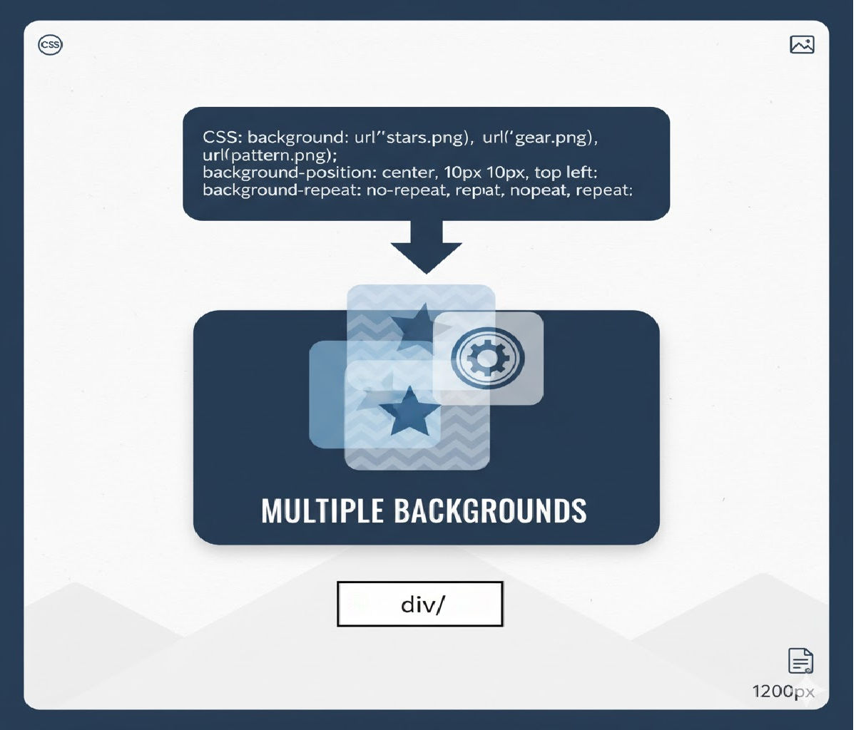
The main CSS property that allows multiple background images on a single element is:
background-image
Instead of specifying only one image, you can supply a comma-separated list of images. Each image becomes a layer in the background stack.
Basic Syntax
.element {
  background-image: url("texture.png"), url("photo.jpg");
}
Here:
texture.pngis drawn on topphoto.jpgis drawn beneath it
The first image listed is always the topmost layer, and subsequent images are stacked behind it.
2. Why Multiple Background Images Matter
Before multiple backgrounds were introduced in CSS3, developers had to:
- Add extra wrapper elements
- Use pseudo-elements (
::before,::after) - Slice images in graphics software
- Use background sprites
Multiple backgrounds eliminate much of that complexity and make designs:
✔ Cleaner
✔ More maintainable
✔ More semantic
✔ Faster to render
✔ Easier to update
Common use cases include:
- Adding overlays and textures to hero images
- Combining gradients with photos
- Creating UI decorations without extra markup
- Building complex patterns or layered illustrations
3. How Multiple Backgrounds Work (Layering Model)
When you define multiple background images:
box {
  background-image: url(top.png), url(middle.png), url(bottom.png);
}
The rendering order is:
top.png→ closest to the usermiddle.pngbottom.png→ farthest back
All backgrounds are painted behind the border and in front of the background color, unless modified with other background properties.
This layering works similarly to Photoshop or design tools — top layers cover lower ones.
4. Using Multiple Backgrounds with Other Background Properties
The real power comes from combining background-image with related properties:
background-positionbackground-sizebackground-repeatbackground-attachmentbackground-originbackground-clip
Each of these also accepts comma-separated values, letting you control each background image independently.
Example
.hero {
  background-image: url("overlay.png"), url("hero.jpg");
  background-position: center, center;
  background-size: contain, cover;
  background-repeat: no-repeat, no-repeat;
}
Here:
| Layer | Image | Position | Size | Repeat |
|---|---|---|---|---|
| Top | overlay.png | center | contain | no-repeat |
| Bottom | hero.jpg | center | cover | no-repeat |
Each comma-separated value corresponds to the image at the same index.
5. Using Gradients as Background Images
CSS gradients (linear-gradient, radial-gradient, conic-gradient) count as images — meaning they can also be layered with photos or other gradients.
Example: Gradient Overlay on Image
.card {
  background-image:
    linear-gradient(rgba(0,0,0,0.6), rgba(0,0,0,0.2)),
    url("mountains.jpg");
  background-size: cover;
  background-position: center;
}
This is one of the most common real-world patterns:
✔ The gradient improves text readability
✔ No need for Photoshop overlays
✔ Fully responsive
✔ Easily adjustable with CSS
6. Practical Examples
Let’s explore several practical scenarios.
Example 1: Texture Over Photo Background
.section {
  background-image: url("noise.png"), url("city.jpg");
  background-repeat: repeat, no-repeat;
  background-size: auto, cover;
  background-position: top left, center;
}
Effect:
- A subtle noise texture overlays a full-bleed image
- Texture tiles, photo fills the container
Example 2: Decorative Corner Elements
.box {
  background-image:
    url("top-left.svg"),
    url("bottom-right.svg");
  background-position:
    top left,
    bottom right;
  background-repeat: no-repeat;
}
This creates decorative corners without extra HTML elements.
Example 3: Watermark Over Content Area
.article {
  background-image: url("watermark.png");
  background-repeat: no-repeat;
  background-position: center;
  background-size: 200px;
}
Now extend to multiple:
.article {
  background-image:
    url("logo-watermark.png"),
    linear-gradient(#fff, #f7f7f7);
}
Example 4: Multiple Patterns
.pattern {
  background-image:
    url("dots.png"),
    url("lines.png"),
    linear-gradient(#fdfdfd, #f0f0f0);
  background-repeat: repeat, repeat, no-repeat;
}
This layers dots over lines over a subtle gradient.
7. The Background Shorthand and Multiple Images
CSS provides the shorthand property:
background
It can define all background properties — including multiple images — in a single declaration.
Example
.box {
  background:
    url("overlay.png") center / contain no-repeat,
    url("photo.jpg") center / cover no-repeat;
}
Breaking this down:
image position / size repeat
Each comma-separated group represents one background layer.
While powerful, shorthand can be harder to read and debug — many developers prefer individual properties for clarity.
8. Controlling Individual Background Layers
Each background-related property can accept multiple comma-separated values:
| Property | Supports multiple values |
|---|---|
| background-image | ✅ Yes |
| background-position | ✅ Yes |
| background-size | ✅ Yes |
| background-repeat | ✅ Yes |
| background-attachment | ✅ Yes |
| background-origin | ✅ Yes |
| background-clip | ✅ Yes |
Example with Full Control
.banner {
  background-image:
    url("logo.svg"),
    linear-gradient(to right, #ff6a00, #ffcc00),
    url("photo.jpg");

  background-position:
    20px 20px,
    center,
    center;

  background-size:
    100px,
    cover,
    cover;

  background-repeat:
    no-repeat,
    no-repeat,
    no-repeat;
}
Layer order:
- Logo on top
- Gradient in the middle
- Photo at the back
9. Default Values When Fewer Values Are Provided
If you specify fewer comma-separated values than background images, CSS repeats the last value.
Example:
.box {
  background-image: url(a.png), url(b.png), url(c.png);
  background-repeat: no-repeat;
}
This is interpreted as:
background-repeat: no-repeat, no-repeat, no-repeat;
This rule applies to all background-* properties.
10. Interaction with Background Color
The background painting order is:
- Background color
- Background images (from bottommost to topmost)
- Border
Example:
.box {
  background-color: #f0f0f0;
  background-image: url("pattern.png"), url("photo.jpg");
}
photo.jpgsits on top of the background colorpattern.pngsits on top ofphoto.jpg
If all background images are transparent in areas, the background color shows through.
11. Background Clipping and Multiple Images
You can control where backgrounds are drawn using:
background-originbackground-clip
Example:
.panel {
  background-image:
    url("border-texture.png"),
    linear-gradient(#fff, #eee);

  background-origin:
    border-box,
    padding-box;

  background-clip:
    border-box,
    padding-box;
}
This allows:
- One background to extend under the border
- Another to remain inside the padding area
Great for advanced UI effects.
12. Browser Support
Multiple background images have been supported in:
- Chrome: since version 1
- Firefox: since version 3.6
- Safari: since version 4
- Edge: full support
- Mobile browsers: full support
In practical terms, every modern browser supports this feature, making it safe for production use.
13. Performance Considerations
While multiple backgrounds are powerful, they still:
- Increase memory usage
- Increase paint complexity
- Add HTTP requests (if images are external)
Best Practices
✔ Use SVG or gradients when possible
✔ Compress raster images
✔ Avoid unnecessary layers
✔ Use background-size: cover carefully on very large images
✔ Prefer CSS gradients over image gradients
Good example:
background-image:
  linear-gradient(rgba(0,0,0,0.5), rgba(0,0,0,0.5)),
  url("hero.webp");
Bad example:
background-image:
  url("overlay1.png"),
  url("overlay2.png"),
  url("overlay3.png"),
  url("overlay4.png"),
  url("overlay5.png"),
  url("overlay6.png");
Unless necessary, too many layers hurt maintainability and performance.
14. Accessibility Considerations
Background images:
- Are decorative by nature
- Cannot contain accessible text
- Are ignored by screen readers
If the image conveys meaning, use:
<img>elements withalt<figure>with captions- Inline SVG with accessibility roles
Use background images primarily for:
✔ Decoration
✔ Texture
✔ Layout enhancement
✔ Visual polish
15. Comparison with Other Techniques
Multiple Backgrounds vs Pseudo-elements
| Feature | Multiple backgrounds | ::before / ::after |
|---|---|---|
| Extra markup | ❌ None | ❌ None |
| Number of layers | Unlimited | Usually 2 |
| Positioning flexibility | High | High |
| Animation complexity | Medium | High |
| DOM impact | None | None |
Multiple backgrounds are usually simpler unless you need independent animations or stacking contexts.
Multiple Backgrounds vs Extra Wrapper Elements
| Feature | Multiple backgrounds | Extra wrappers |
|---|---|---|
| Semantic HTML | ✅ Clean | ❌ Often cluttered |
| Maintainability | ✅ High | ❌ Lower |
| Styling complexity | Medium | High |
| Performance | Better | Worse |
16. Advanced Techniques
A. Parallax-like Effects
.section {
  background-image:
    url("foreground.png"),
    url("background.jpg");
  background-attachment:
    scroll,
    fixed;
}
This creates subtle depth effects (though background-attachment: fixed behaves differently on mobile).
B. Icon Over Gradient Button
.button {
  background-image:
    url("icon.svg"),
    linear-gradient(to right, #4facfe, #00f2fe);
  background-repeat: no-repeat;
  background-position: 16px center, center;
  padding-left: 48px;
  color: white;
}
This creates a button with a left icon and gradient background — no extra HTML elements.
C. Pattern Masking
.masked {
  background-image:
    url("pattern.svg"),
    linear-gradient(#ff6a00, #ffcc00);
  background-blend-mode: multiply;
}
Combining multiple backgrounds with background-blend-mode allows advanced compositing.
17. Using Background Blend Modes with Multiple Images
Another advanced property that pairs with multiple backgrounds is:
background-blend-mode
It defines how background layers blend with each other.
Example:
.box {
  background-image:
    url("texture.png"),
    url("photo.jpg");
  background-blend-mode: overlay;
}
Or per layer:
background-blend-mode: multiply, normal;
This enables effects similar to Photoshop blend modes — without extra images.
18. Debugging Multiple Backgrounds
Common mistakes include:
❌ Forgetting commas
❌ Mismatched number of values
❌ Using shorthand that overrides previous declarations
❌ Assuming first image is bottom layer (it’s top)
Example mistake:
background-image: url(a.png) url(b.png); /* ❌ Missing comma */
Correct:
background-image: url(a.png), url(b.png);
19. Real-World Design Pattern: Hero Section
.hero {
  min-height: 80vh;
  background-image:
    linear-gradient(
      rgba(0,0,0,0.7),
      rgba(0,0,0,0.3)
    ),
    url("hero.webp");
  background-size: cover;
  background-position: center;
  color: white;
  display: flex;
  align-items: center;
  justify-content: center;
}
Why this works well:
✔ Gradient ensures text readability
✔ Image remains responsive
✔ No extra elements
✔ Easy theme customization
20. Summary Answer
The CSS property that helps you set multiple background images on one element is:
✅
background-image
By providing a comma-separated list of images, you can layer multiple backgrounds on the same element. Each layer can be controlled independently using related background properties like background-position, background-size, and background-repeat.


