How can you use Flexbox to align a button to the right inside a container?
How to Use Flexbox to Align a Button to the Right Inside a Container
Flexbox (Flexible Box Layout) is one of the most powerful layout systems in CSS. It allows you to align, distribute, and control spacing of elements inside a container in a clean and predictable way. If you want to align a button to the right inside a container, Flexbox gives you multiple elegant solutions depending on the layout context.
Let’s start from the foundation and build upward.
1. Understanding the Flex Container and Flex Items
Before aligning anything, you need to understand two key concepts:
- Flex Container → The parent element with
display: flex - Flex Items → The direct children inside the flex container
When you apply:
.container {
  display: flex;
}
You activate Flexbox for that container. From that moment:
- Items align horizontally by default
- The main axis runs left → right
- The cross axis runs top → bottom
By default:
flex-direction: rowjustify-content: flex-startalign-items: stretch
So everything aligns to the left unless you change it.
2. The Simplest Way: justify-content: flex-end
If the button is the only item inside the container, this is the cleanest approach.
HTML
<div class="container">
  <button>Click Me</button>
</div>
CSS
.container {
  display: flex;
  justify-content: flex-end;
}
What This Does
display: flexactivates Flexboxjustify-contentcontrols alignment along the main axisflex-endpushes content to the right
Because the default direction is row, the main axis is horizontal. So flex-end means “move to the right.”
This method works perfectly when:
- You only have one element
- You want all items aligned right
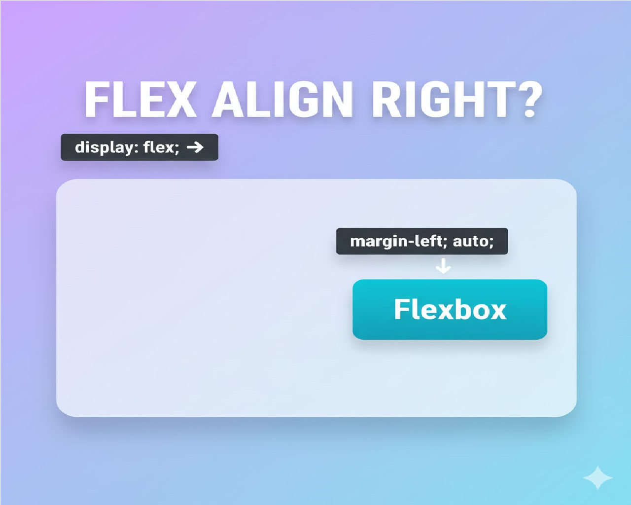
3. Using margin-left: auto (Most Common Real-World Approach)
This is the most flexible and widely used method when there are multiple elements.
HTML
<div class="container">
  <span>Title</span>
  <button>Click Me</button>
</div>
CSS
.container {
  display: flex;
}

button {
  margin-left: auto;
}
Why This Works
In Flexbox, margin-left: auto absorbs all available free space.
So what happens?
- Flex container arranges items left to right.
- The button gets automatic left margin.
- That margin expands.
- The button gets pushed to the right.
This method is superior when:
- You want the first element left
- Button right
- Space dynamically calculated
This is extremely common in navigation bars and headers.
4. Difference Between justify-content and margin-left: auto
Let’s clarify something important.
Using justify-content: flex-end
.container {
  display: flex;
  justify-content: flex-end;
}
This moves all flex items to the right.
Using margin-left: auto
button {
  margin-left: auto;
}
This moves only the button.
That’s the key difference.
If you have:
- Logo
- Title
- Button
And you use justify-content: flex-end, everything shifts right.
But if you use margin-left: auto on the button, only the button moves.
5. Full Layout Example (Common UI Pattern)
Let’s build something practical.
HTML
<div class="header">
  <h2>Dashboard</h2>
  <button class="logout-btn">Logout</button>
</div>
CSS
.header {
  display: flex;
  align-items: center;
}

.logout-btn {
  margin-left: auto;
}
Now:
- “Dashboard” stays left
- “Logout” aligns right
- Both stay vertically centered
This pattern is used in almost every web app header.
6. Using flex-direction Column (Vertical Layout Case)
What if your layout is vertical?
If you use:
.container {
  display: flex;
  flex-direction: column;
}
Now the main axis becomes vertical.
So:
justify-contentcontrols vertical alignmentalign-itemscontrols horizontal alignment
To move button right in column layout:
.container {
  display: flex;
  flex-direction: column;
  align-items: flex-end;
}
OR
button {
  align-self: flex-end;
}
7. Using align-self for One Button
If you want only the button aligned right:
button {
  align-self: flex-end;
}
This overrides container alignment for that single element.
Works when:
- flex-direction is column
- you want only one item aligned differently
8. Real-World Scenario: Form Layout
Example:
<div class="form-footer">
  <button type="submit">Submit</button>
</div>
CSS
.form-footer {
  display: flex;
  justify-content: flex-end;
}
This is common in forms where submit button is right-aligned.
9. Responsive Behavior Considerations
Flexbox is responsive by nature.
For mobile:
@media (max-width: 600px) {
  .container {
    flex-direction: column;
  }

  button {
    margin-left: 0;
    align-self: flex-end;
  }
}
You can dynamically change alignment behavior based on screen size.
10. Why Flexbox Is Better Than float: right
Old method:
button {
  float: right;
}
Problems:
- Removes element from normal flow
- Hard to vertically center
- Breaks layouts easily
Flexbox:
- Maintains flow
- Easy centering
- Responsive by default
- Cleaner code
Flexbox is modern and recommended.
11. Complete Example (Production Ready)
HTML
<div class="card">
  <p>Are you sure you want to continue?</p>
  <div class="actions">
    <button class="cancel">Cancel</button>
    <button class="confirm">Confirm</button>
  </div>
</div>
CSS
.actions {
  display: flex;
  justify-content: flex-end;
  gap: 10px;
}
This aligns both buttons to the right with spacing.
12. Common Mistakes
- Forgetting
display: flex - Applying
margin-left: autoto container instead of button - Confusing main axis and cross axis
- Using align-items when you mean justify-content
Remember:
- Row → justify = horizontal
- Column → justify = vertical
13. Advanced: Combining Space Between
Sometimes you want:
Left item → Right button
Instead of margin auto, you can use:
.container {
  display: flex;
  justify-content: space-between;
}
But this only works cleanly if there are exactly two items.
14. Performance and Browser Support
Flexbox:
- Fully supported in modern browsers
- No vendor prefixes needed
- Highly optimized
- Better than grid for 1D layouts
For simple alignment, Flexbox is ideal.
15. Summary of Methods
| Scenario | Best Method |
|---|---|
| Only button in container | justify-content: flex-end |
| Multiple items, button right | margin-left: auto |
| Column layout | align-self: flex-end |
| Two items separated | space-between |


