How can you create a circular image using only CSS?
How Can You Create a Circular Image Using Only CSS?
Creating circular images is a very common requirement in modern web design. Profile pictures, avatars, testimonial photos, team member cards, and user icons often appear in circular frames because circles feel friendly, clean, and visually balanced.
The good news is:
👉 You can create perfect circular images using only CSS, without editing the image itself or using graphics software.
In this detailed guide, you’ll learn:
✅ The simplest and most reliable way to make circular images
✅ Multiple CSS techniques for different layouts and use cases
✅ How to handle responsive images
✅ How to crop images into circles without distortion
✅ Best practices, accessibility tips, and real-world examples
By the end, you’ll be able to confidently create circular images in any
🔍 Why Use Circular Images?
Circular images are commonly used because they:
- Draw attention to faces and icons
- Look clean and modern
- Work well in cards, chats, and navigation bars
- Help distinguish user-generated content
Instead of manually cropping images into circles using image editors, CSS lets you do it dynamically, responsively, and consistently across devices.
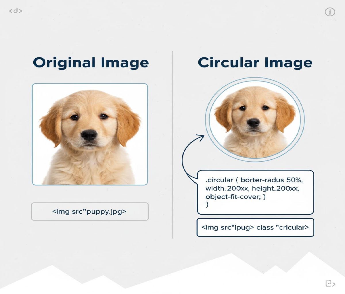
🏆 Best and Simplest Method: border-radius: 50%
Concept
If an element is square, applying:
border-radius: 50%;
turns it into a perfect circle. When used on an <img> tag, it crops the image into a circle.
✅ Method 1: Circular Image Using border-radius: 50% (Most Common)
HTML
<img src="avatar.jpg" alt="Profile photo" class="avatar">
CSS
.avatar {
  width: 150px;
  height: 150px;
  border-radius: 50%;
  object-fit: cover;
}
How It Works
widthandheightmake the image square.border-radius: 50%turns the square into a circle.object-fit: coverensures the image fills the circle without stretching.
Result
You get a perfectly round image regardless of the original photo’s aspect ratio.
✅ Method 2: Responsive Circular Image (Auto-Scaling)
Sometimes you don’t want to fix the size. Instead, you want the image to scale with its container.
HTML
<div class="avatar-wrapper">
  <img src="avatar.jpg" alt="User avatar">
</div>
CSS
.avatar-wrapper {
  width: 30%;
  aspect-ratio: 1 / 1;
  border-radius: 50%;
  overflow: hidden;
}

.avatar-wrapper img {
  width: 100%;
  height: 100%;
  object-fit: cover;
}
Why This Works
aspect-ratio: 1 / 1keeps the container square.overflow: hiddenclips the image into the circular shape.- The image remains responsive.
✅ Method 3: Circular Image Using a Wrapper and overflow: hidden
This is useful if you don’t want to apply styles directly to the <img> element.
HTML
<div class="circle">
  <img src="photo.jpg" alt="Team member">
</div>
CSS
.circle {
  width: 120px;
  height: 120px;
  border-radius: 50%;
  overflow: hidden;
}

.circle img {
  width: 100%;
  height: 100%;
  object-fit: cover;
}
Advantages
✔ Works even in older browsers
✔ Keeps your image styles separate
✔ Easy to add borders, shadows, or effects
✅ Method 4: Circular Background Image Using background-image
Sometimes you’re not using <img> tags — for example, when building avatars in UI components.
HTML
<div class="profile-pic"></div>
CSS
.profile-pic {
  width: 120px;
  height: 120px;
  border-radius: 50%;
  background-image: url("avatar.jpg");
  background-size: cover;
  background-position: center;
}
Why Use This?
✔ No <img> element required
✔ Perfect for placeholders and fallback avatars
✔ Easy to layer icons or overlays
✅ Method 5: Circular Image Using clip-path: circle()
This is a modern, CSS-only clipping method.
HTML
<img src="avatar.jpg" alt="User avatar" class="clip-circle">
CSS
.clip-circle {
  width: 150px;
  height: 150px;
  object-fit: cover;
  clip-path: circle(50%);
}
Advantages
✔ Precise clipping
✔ Works with animations
✔ Can create partial circles
Browser Support
Good in modern browsers, but border-radius has wider compatibility.
✅ Method 6: Perfect Circle with Border and Shadow
Often, avatars need borders or shadows.
HTML
<img src="avatar.jpg" alt="Profile" class="avatar-bordered">
CSS
.avatar-bordered {
  width: 140px;
  height: 140px;
  border-radius: 50%;
  object-fit: cover;
  border: 4px solid #fff;
  box-shadow: 0 4px 10px rgba(0, 0, 0, 0.15);
}
Result
A clean circular image with depth and separation from the background.
🎯 Real-World Example: Circular Profile Card
Let’s build a complete UI component using circular images.
HTML
<div class="profile-card">
  <img src="user.jpg" alt="Jane Doe" class="profile-img">
  <h3>Jane Doe</h3>
  <p>Frontend Developer</p>
</div>
CSS
.profile-card {
  width: 260px;
  padding: 20px;
  background: #fff;
  border-radius: 16px;
  text-align: center;
  box-shadow: 0 4px 12px rgba(0, 0, 0, 0.08);
}

.profile-img {
  width: 120px;
  height: 120px;
  border-radius: 50%;
  object-fit: cover;
  margin-bottom: 12px;
}
Why This Works Well
- Circular image draws attention to the face
- Fixed square size ensures perfect circle
- Clean, reusable pattern
🧠 Handling Non-Square Images Correctly
Most photos aren’t square by default. If you simply apply border-radius: 50% without controlling dimensions, you might get an oval instead of a circle.
❌ Problem Example
img {
  border-radius: 50%;
}
If the image is rectangular, the result becomes elliptical.
✅ Correct Solution
Always ensure:
width === height
or use a wrapper with:
aspect-ratio: 1 / 1;
and:
object-fit: cover;
⚡ Best Practice Pattern (Production-Ready)
Here’s the most reliable and scalable pattern:
.avatar {
  width: 80px;
  aspect-ratio: 1 / 1;
  border-radius: 50%;
  object-fit: cover;
}
Usage:
<img src="avatar.jpg" alt="User avatar" class="avatar">
✔ Responsive
✔ No wrapper needed
✔ Clean
✔ Modern browser support
♿ Accessibility Considerations
When using circular images, especially profile photos:
- Always include
alttext:
<img src="avatar.jpg" alt="Profile picture of John Smith">
- Don’t rely solely on images to convey identity — pair with text labels.
- Ensure good contrast if using borders or shadows.
⚠️ Common Mistakes to Avoid
❌ Forgetting to make width and height equal
img {
  width: 200px;
  height: 120px;
  border-radius: 50%; /* Results in oval */
}
❌ Not using object-fit: cover
img {
  width: 120px;
  height: 120px;
  border-radius: 50%;
}
This can distort images instead of cropping them.
❌ Using large images without resizing
Always resize images in CSS or HTML to avoid performance issues.
🧪 Advanced Technique: Animated Circular Image Border
Let’s create a hover effect with a glowing ring around a circular avatar.
HTML
<div class="avatar-ring">
  <img src="avatar.jpg" alt="User avatar">
</div>
CSS
.avatar-ring {
  position: relative;
  width: 120px;
  height: 120px;
  border-radius: 50%;
  padding: 4px;
  background: linear-gradient(45deg, #ff00cc, #3333ff);
}

.avatar-ring img {
  width: 100%;
  height: 100%;
  border-radius: 50%;
  object-fit: cover;
  background: white;
}
This creates a circular image with a gradient ring — perfect for featured profiles or stories.
🔥 Circular Image in Flexbox or Grid Layouts
Circular images integrate seamlessly into modern layouts.
Example: Team Grid
HTML
<div class="team">
  <div class="member">
    <img src="a.jpg" alt="Alice" class="avatar">
    <p>Alice</p>
  </div>
  <div class="member">
    <img src="b.jpg" alt="Bob" class="avatar">
    <p>Bob</p>
  </div>
</div>
CSS
.team {
  display: grid;
  grid-template-columns: repeat(auto-fit, minmax(140px, 1fr));
  gap: 20px;
  text-align: center;
}

.avatar {
  width: 96px;
  height: 96px;
  border-radius: 50%;
  object-fit: cover;
}
📱 Mobile-Friendly Circular Images
To make avatars responsive on mobile:
.avatar {
  width: clamp(64px, 20vw, 120px);
  aspect-ratio: 1 / 1;
  border-radius: 50%;
  object-fit: cover;
}
This scales smoothly across screen sizes.
🧠 Comparing All CSS Methods
| Method | Easiest | Responsive | Browser Support | Best Use Case |
|---|---|---|---|---|
border-radius: 50% on <img> | ⭐⭐⭐⭐⭐ | ⭐⭐⭐⭐ | ⭐⭐⭐⭐⭐ | Most cases |
| Wrapper + overflow hidden | ⭐⭐⭐⭐ | ⭐⭐⭐⭐ | ⭐⭐⭐⭐⭐ | Custom borders |
| Background-image method | ⭐⭐⭐⭐ | ⭐⭐⭐ | ⭐⭐⭐⭐⭐ | Avatars, placeholders |
clip-path: circle() | ⭐⭐⭐ | ⭐⭐⭐⭐ | ⭐⭐⭐ | Animations |
| SVG mask | ⭐⭐ | ⭐⭐⭐⭐ | ⭐⭐⭐ | Advanced effects |
🏆 Best Overall Recommendation
Use
border-radius: 50%with equal width and height plusobject-fit: cover.
Gold Standard Code
.avatar {
  width: 100px;
  aspect-ratio: 1 / 1;
  border-radius: 50%;
  object-fit: cover;
}
<img src="avatar.jpg" alt="User avatar" class="avatar">
This approach is:
✔ Simple
✔ Clean
✔ Responsive
✔ Performant
✔ Supported everywhere
📌 Final Summary
To create a circular image using only CSS:
- Make the element square
- Apply
border-radius: 50% - Use
object-fit: coverto prevent distortion
You can also use wrappers, background images, or clip-path for more advanced layouts — but in 95% of cases, the basic approach is the best.


