How can you add a semi-transparent overlay on top of a background image?
How Can You Add a Semi-Transparent Overlay on Top of a Background Image?
Adding a semi-transparent overlay on top of a background image is a common and powerful design technique in modern web development. It improves text readability, enhances visual hierarchy, creates mood and branding consistency, and helps unify content areas without editing image assets.
Whether you’re building hero sections, cards, banners, modals, or full-page layouts, overlays allow you to control contrast and aesthetics using pure CSS — no Photoshop required.
In this in-depth guide, you’ll learn:
- What overlays are and why they matter
- Multiple CSS techniques for creating semi-transparent overlays
- Best practices for layering overlays with content
- Accessibility and performance considerations
- Real-world UI patterns
- Complete working examples
By the end, you’ll know how to create overlays using gradients, pseudo-elements, background layers, and modern layout tools — all with clean, maintainable code.
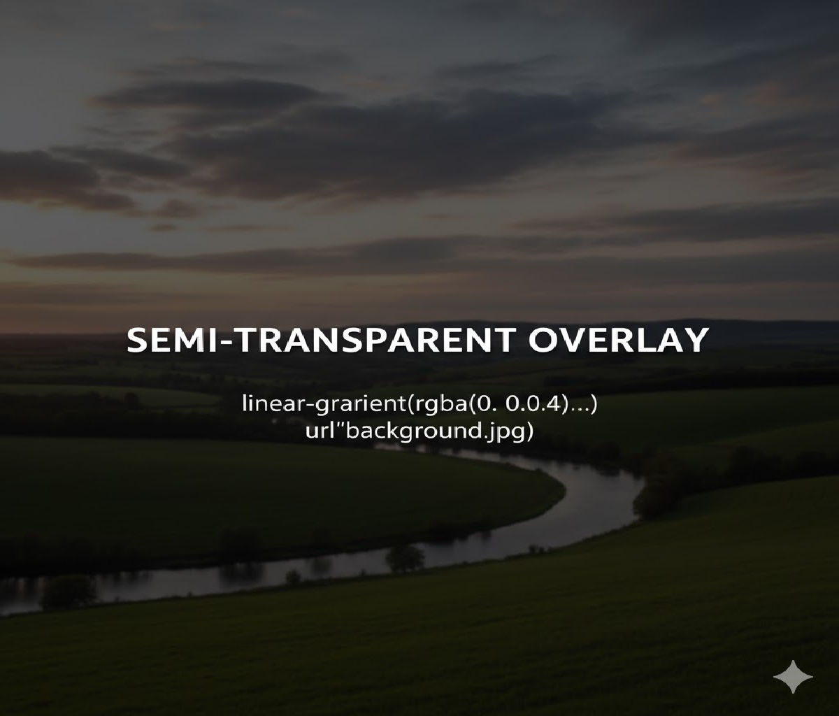
1. What Is a Semi-Transparent Overlay?
A semi-transparent overlay is a layer placed above a background image (or video) but below foreground content such as text or buttons. The overlay typically uses a partially transparent color — for example:
rgba(0, 0, 0, 0.5)(black at 50% opacity)rgba(255, 255, 255, 0.4)(white at 40% opacity)- A semi-transparent gradient
The overlay serves several purposes:
- Improves text contrast and readability
- Adds visual consistency across different images
- Creates branding effects (color tinting)
- Helps guide user focus
- Enables subtle design effects without image editing
2. Why Not Just Edit the Image?
Before CSS overlays, designers often baked overlays into images using Photoshop or similar tools. This approach had drawbacks:
- Images had to be regenerated for every design tweak
- No responsiveness — different screens required different assets
- Higher bandwidth usage
- No dynamic theming (dark mode, hover effects, etc.)
CSS overlays are:
- Lightweight
- Responsive
- Easily customizable
- Animatable
- Accessible when done correctly
That’s why overlays today are almost always implemented using CSS instead of static images.
3. The Most Common Techniques for Overlays
There are several reliable ways to add a semi-transparent overlay over a background image:
- Using multiple backgrounds (layered backgrounds)
- Using a pseudo-element (
::beforeor::after) - Using an extra HTML overlay element
- Using a linear gradient over an image
- Using CSS blend modes
- Using absolute positioning with opacity
- Using CSS variables for dynamic overlays
We’ll cover all of these approaches — starting from simplest to most flexible.
4. Method 1: Using Multiple Background Layers (Best for Simplicity)
CSS allows multiple background layers, separated by commas. The first background is drawn on top, the last at the bottom.
Example: Semi-Transparent Overlay Using Linear Gradient
.hero {
  height: 100vh;
  background:
    linear-gradient(rgba(0, 0, 0, 0.5), rgba(0, 0, 0, 0.5)),
    url("hero.jpg") center / cover no-repeat;
  color: white;
  display: flex;
  align-items: center;
  justify-content: center;
}
HTML
<section class="hero">
  <h1>Welcome to Our Website</h1>
</section>
How It Works
- The
linear-gradient()creates a semi-transparent black overlay. - The background image is layered underneath.
- No extra markup or pseudo-elements required.
- Works in all modern browsers.
Advantages
✅ Clean and simple
✅ No positioning complexity
✅ Easy to animate or theme
✅ No z-index issues
5. Method 2: Using a Pseudo-Element Overlay (Most Flexible)
This is the most powerful and commonly used technique in professional layouts. You create an overlay using ::before or ::after and position it absolutely inside a container.
HTML
<section class="hero">
  <div class="content">
    <h1>Discover the World</h1>
    <p>Adventure starts here.</p>
  </div>
</section>
CSS
.hero {
  position: relative;
  height: 100vh;
  background: url("hero.jpg") center / cover no-repeat;
  display: flex;
  align-items: center;
  justify-content: center;
  color: white;
}

.hero::before {
  content: "";
  position: absolute;
  inset: 0;
  background: rgba(0, 0, 0, 0.5);
  z-index: 1;
}

.hero .content {
  position: relative;
  z-index: 2;
  text-align: center;
}
How It Works
- The
::beforepseudo-element spans the entire container. - It sits above the image but below the content.
- The
z-indexensures correct stacking.
Advantages
✅ Maximum flexibility
✅ Works with images, videos, gradients
✅ Easy to animate or swap colors
✅ Ideal for complex layouts
6. Method 3: Using an Extra Overlay <div>
Sometimes, especially when working with frameworks or JavaScript-driven animations, adding a dedicated overlay element is clearer.
HTML
<section class="hero">
  <div class="overlay"></div>
  <div class="content">
    <h1>Build Beautiful Interfaces</h1>
    <p>Modern web design starts here.</p>
  </div>
</section>
CSS
.hero {
  position: relative;
  height: 100vh;
  background: url("hero.jpg") center / cover no-repeat;
}

.hero .overlay {
  position: absolute;
  inset: 0;
  background: rgba(0, 0, 0, 0.5);
}

.hero .content {
  position: relative;
  z-index: 1;
  color: white;
  text-align: center;
  top: 50%;
  transform: translateY(-50%);
}
Advantages
✅ Explicit structure
✅ Easy to toggle visibility with JS
✅ Useful for animations and effects
7. Method 4: Using a Gradient Overlay
Instead of a flat color overlay, you can use a gradient overlay for more dynamic effects.
Example: Dark-to-Transparent Overlay
.banner {
  background:
    linear-gradient(
      to bottom,
      rgba(0, 0, 0, 0.7),
      rgba(0, 0, 0, 0.1)
    ),
    url("banner.jpg") center / cover no-repeat;
  color: white;
  padding: 80px;
}
This is commonly used when:
- Text appears at the top of an image
- You want visual depth
- You want to preserve image clarity in one area
8. Method 5: Using background-blend-mode
You can blend a color overlay with an image using CSS blend modes.
Example
.hero {
  background:
    rgba(0, 0, 0, 0.5) url("hero.jpg") center / cover no-repeat;
  background-blend-mode: overlay;
  color: white;
}
Available Blend Modes
multiplyoverlayscreendarkenlightensoft-lighthard-light
When to Use This
- For creative visual effects
- For branding color tints
- When artistic blending is more important than predictability
⚠️ Blend modes may behave differently across browsers and images, so test carefully.
9. Method 6: Using Absolute Positioned Overlay with Opacity
This is similar to the pseudo-element method but uses a real element.
HTML
<div class="card">
  <img src="image.jpg" alt="Card image" />
  <div class="overlay"></div>
  <div class="text">Card Title</div>
</div>
CSS
.card {
  position: relative;
  width: 300px;
  height: 200px;
  overflow: hidden;
}

.card img {
  width: 100%;
  height: 100%;
  object-fit: cover;
}

.card .overlay {
  position: absolute;
  inset: 0;
  background: rgba(0, 0, 0, 0.4);
}

.card .text {
  position: absolute;
  bottom: 20px;
  left: 20px;
  color: white;
  z-index: 1;
}
10. Method 7: Using CSS Variables for Dynamic Overlays
You can make overlays themeable and adjustable using CSS custom properties.
CSS
:root {
  --overlay-color: rgba(0, 0, 0, 0.5);
}

.hero {
  position: relative;
  background: url("hero.jpg") center / cover no-repeat;
}

.hero::before {
  content: "";
  position: absolute;
  inset: 0;
  background: var(--overlay-color);
}
Dynamic Theme Change
.dark-theme {
  --overlay-color: rgba(0, 0, 0, 0.7);
}

.light-theme {
  --overlay-color: rgba(255, 255, 255, 0.4);
}
11. Improving Text Readability with Overlays
One of the most important reasons for overlays is accessibility. Text placed directly over images often fails contrast guidelines.
Bad Example
.hero {
  background: url("bright-image.jpg") center / cover no-repeat;
  color: white;
}
Text may disappear in bright areas.
Accessible Example
.hero {
  position: relative;
  background: url("bright-image.jpg") center / cover no-repeat;
  color: white;
}

.hero::before {
  content: "";
  position: absolute;
  inset: 0;
  background: rgba(0, 0, 0, 0.55);
}

.hero * {
  position: relative;
  z-index: 1;
}
This ensures sufficient contrast across all image regions.
12. Overlay with Hover Effects
Overlays are often used for hover interactions on cards or images.
Example: Hover Fade-In Overlay
.card {
  position: relative;
  width: 300px;
  height: 200px;
  background: url("photo.jpg") center / cover no-repeat;
  overflow: hidden;
}

.card::before {
  content: "";
  position: absolute;
  inset: 0;
  background: rgba(0, 0, 0, 0.6);
  opacity: 0;
  transition: opacity 0.3s ease;
}

.card:hover::before {
  opacity: 1;
}

.card .text {
  position: absolute;
  bottom: 20px;
  left: 20px;
  color: white;
  opacity: 0;
  transition: opacity 0.3s ease;
}

.card:hover .text {
  opacity: 1;
}
13. Overlay with Background Videos
The same techniques apply when using videos.
HTML
<section class="hero">
  <video autoplay muted loop playsinline>
    <source src="video.mp4" type="video/mp4" />
  </video>
  <div class="content">
    <h1>Experience Motion</h1>
  </div>
</section>
CSS
.hero {
  position: relative;
  height: 100vh;
  overflow: hidden;
}

.hero video {
  position: absolute;
  inset: 0;
  width: 100%;
  height: 100%;
  object-fit: cover;
}

.hero::before {
  content: "";
  position: absolute;
  inset: 0;
  background: rgba(0, 0, 0, 0.5);
}

.hero .content {
  position: relative;
  z-index: 1;
  color: white;
  text-align: center;
  top: 50%;
  transform: translateY(-50%);
}
14. Animated Overlays
You can animate overlays for interactive or cinematic effects.
Example: Pulsing Overlay
.hero::before {
  content: "";
  position: absolute;
  inset: 0;
  background: rgba(0, 0, 0, 0.4);
  animation: pulse 4s ease-in-out infinite;
}

@keyframes pulse {
  0%, 100% {
    background: rgba(0, 0, 0, 0.4);
  }
  50% {
    background: rgba(0, 0, 0, 0.6);
  }
}
15. Performance Considerations
Overlays are generally very cheap in performance terms because:
- They’re just painted layers
- No layout recalculation is needed
- No network requests are involved
However:
- Avoid animating
opacityon huge full-screen overlays too frequently. - Prefer hardware-accelerated properties (
transform) when possible. - Avoid stacking too many layered backgrounds on low-powered devices.
16. Accessibility Best Practices
When using overlays:
- Ensure sufficient contrast between text and background.
- Avoid making overlays too dark if content is large and bold.
- Avoid flashing or rapidly animated overlays.
- Test with screen readers — overlays should not interfere with semantic structure.
- Use overlays as decoration, not content.
17. Full Real-World Example: Hero Section with Overlay
Here’s a complete, production-style example.
HTML
<!DOCTYPE html>
<html lang="en">
<head>
  <meta charset="UTF-8" />
  <title>Overlay Example</title>
  <style>
    * {
      box-sizing: border-box;
      margin: 0;
      padding: 0;
    }

    body {
      font-family: Arial, sans-serif;
      line-height: 1.5;
    }

    .hero {
      position: relative;
      height: 100vh;
      background: url("https://images.unsplash.com/photo-1500530855697-b586d89ba3ee")
        center / cover no-repeat;
      display: flex;
      align-items: center;
      justify-content: center;
      color: white;
      text-align: center;
      padding: 20px;
    }

    .hero::before {
      content: "";
      position: absolute;
      inset: 0;
      background: rgba(0, 0, 0, 0.55);
    }

    .hero-content {
      position: relative;
      z-index: 1;
      max-width: 700px;
    }

    .hero h1 {
      font-size: 3rem;
      margin-bottom: 16px;
    }

    .hero p {
      font-size: 1.25rem;
      margin-bottom: 24px;
    }

    .hero button {
      padding: 12px 24px;
      border: none;
      border-radius: 8px;
      background: linear-gradient(to right, #ff512f, #dd2476);
      color: white;
      font-size: 16px;
      cursor: pointer;
      transition: transform 0.2s ease, box-shadow 0.2s ease;
    }

    .hero button:hover {
      transform: translateY(-2px);
      box-shadow: 0 8px 20px rgba(0, 0, 0, 0.3);
    }
  </style>
</head>
<body>
  <section class="hero">
    <div class="hero-content">
      <h1>Build Stunning Websites</h1>
      <p>Use semi-transparent overlays to improve readability and aesthetics.</p>
      <button>Get Started</button>
    </div>
  </section>
</body>
</html>
18. Common Mistakes to Avoid
❌ Forgetting to set position: relative on the container
❌ Overlay covering text due to incorrect z-index
❌ Using opacity on the parent instead of the overlay
❌ Making overlays too dark, hiding image details
❌ Using overlays without testing contrast
19. Best Practice Summary
| Goal | Best Technique |
|---|---|
| Quick overlay | Multiple backgrounds |
| Full flexibility | Pseudo-element overlay |
| Hover effects | Pseudo-element with opacity |
| Dynamic theming | CSS variables |
| Video overlay | Absolute positioned overlay |
| Artistic effects | Blend modes |
20. Final Answer
To add a semi-transparent overlay on top of a background image, the most professional and flexible method is to use a pseudo-element (::before or ::after) or layered backgrounds with a semi-transparent color or gradient.
Simplest Example
.hero {
  background:
    linear-gradient(rgba(0, 0, 0, 0.5), rgba(0, 0, 0, 0.5)),
    url("image.jpg") center / cover no-repeat;
  color: white;
}
Most Flexible Example
.hero {
  position: relative;
  background: url("image.jpg") center / cover no-repeat;
}

.hero::before {
  content: "";
  position: absolute;
  inset: 0;
  background: rgba(0, 0, 0, 0.5);
}

.hero * {
  position: relative;
  z-index: 1;
}
Conclusion
Semi-transparent overlays are one of the most powerful tools in modern UI design. They let you improve readability, apply branding tints, enhance visual depth, and unify layouts — all without editing image assets or sacrificing performance.
Whether you choose layered backgrounds for simplicity or pseudo-elements for flexibility, overlays are easy to implement, highly maintainable, and fully responsive. Mastering this technique will dramatically improve the quality, accessibility, and professionalism of your web designs.


